Getting to Grips with the Cursive 'V'
You know, there are some letters in the cursive alphabet that just seem to glide off the page naturally. Then there are others, like the cursive 'v', that can sometimes feel a bit like trying to navigate a tricky corner without bumping into anything. It's fascinating, isn't it? For many, the 'v' presents a unique challenge, whether it's connecting it smoothly to the next letter or getting that distinctive loop just right. But don't you worry, I'm here to walk you through everything there is to know about this often-misunderstood letter.
We're going to break down its formation, look at why it might trip some people up, and then I'll share some fantastic tips to help you get your cursive 'v' looking absolutely splendid. Seriously, by the time we're done, you'll be writing 'v's that would make a penmanship master proud. It's all about understanding the mechanics, a little bit of history, and a good dose of practice. Ready?
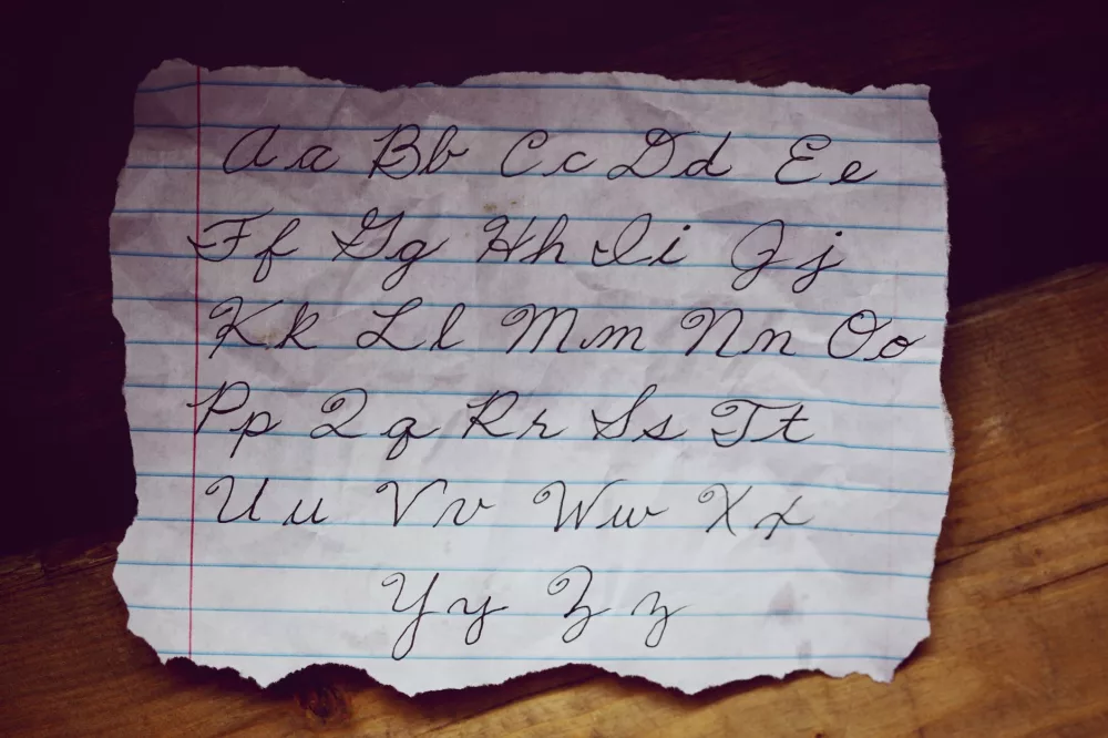
How to Form the Lowercase Cursive 'v'
Let's start with the lowercase 'v' because it's often the one you'll use most frequently. It's got this lovely, almost wave-like quality to it, I think. But the trick really lies in that tiny little loop or hook at the top. Missing that is a common error, so pay close attention.
- Starting Point: Begin at the baseline, just like many other lowercase letters.
- Upstroke: Gently curve up towards the midline, making a slight curve to the left as you go. Think of it as a gentle upward swoop.
- Downward Stroke: From the midline, turn sharply and come straight down to the baseline. This needs to be a nice, clean line.
- Another Upstroke: Without lifting your pen, go back up along the same line (or very close to it) about two-thirds of the way to the midline.
- The Loop/Hook: Here's the key part! From this point, make a very small, almost horizontal loop or hook that extends to the right. It should look like a tiny little flag waving.
- Connector: This loop then smoothly transitions into the connector stroke that'll take you to the next letter. That little connection is super important for flow.
It's not just about drawing lines; it's about the fluidity. You want it to feel like one continuous movement, even with that slight pause or change in direction for the hook. Practice it slowly at first, then pick up the pace once you feel more confident.
Crafting the Uppercase Cursive 'V'
Now, the uppercase 'V' is a different beast entirely, isn't it? It's often quite grand and can really make a word stand out. It frequently starts with a flourish, which can be intimidating, but trust me, it's not as hard as it looks. You'll often see variations, but here's a common and elegant way to write it:
- Starting Point: Begin just below the top line, with a slight curve.
- First Downstroke: Draw a graceful curve downwards, swooping to the left, all the way to the baseline. This should feel expansive.
- First Upstroke: From the baseline, make a strong, straight upward stroke, angling towards the right, until you reach the top line again. This forms the first 'leg' of the 'V'.
- Second Downstroke: Immediately, without lifting your pen, reverse direction and come down again, but this time, curve slightly to the right as you approach the baseline. You're creating the second 'leg' now.
- The Flourish/Loop: When you hit the baseline, instead of stopping, make a small, elegant loop that curls upwards and to the right, often ending just below the midline or even a bit higher. This is your exit stroke, ready to connect to the next letter.
The uppercase 'V' really is about drama and flow. It should command attention. The flourish can vary wildly depending on the style you're learning, so don't be afraid to experiment a little once you've got the basic structure down.
Why the Cursive 'V' Can Be a Bit Tricky
So, why do some people find the 'v' so challenging? I've seen it firsthand, and I think it boils down to a couple of things:
- The Elusive Hook: For the lowercase 'v', that tiny top hook is often either omitted entirely, making it look like a 'u', or it's made too large, disrupting the letter's balance. It's a subtle movement that requires fine motor control.
- Connecting to the Next Letter: Because of that hook, the connection point for the lowercase 'v' is quite high. If you're used to connecting from the baseline, this can feel awkward and lead to messy joins.
- Uppercase Flourishes: The grandeur of the uppercase 'V' can be intimidating. People might rush the flourishes or make them too stiff, losing that graceful, sweeping quality that makes it so beautiful.
- Similarities to Other Letters: The lowercase 'v' can be confused with 'u' if the hook isn't clear, or even 'w' if it's connected poorly. Distinctiveness is key.
Honestly, it's not a flaw in your handwriting; it's just a letter that demands a little more thought than some of its simpler cousins.
Tips and Tricks for a Perfect Cursive 'V'
Okay, so you understand the challenges. Now, let's get into how we can conquer them. I've got some practical advice that I truly believe will make a difference.
Practice, Practice, Practice – But Smartly!
This isn't just about repetition; it's about mindful repetition. Don't just scrawl 'v's aimlessly.
- Slow Down: Especially when you're starting, write slowly. Focus on each stroke. Feel the pen moving.
- Trace and Copy: Use tracing paper over examples or simply copy good examples meticulously. Your muscle memory will thank you.
- Connect to Different Letters: Don't just write 'v' in isolation. Practice writing 'va', 've', 'vi', 'vo', 'vu', and then try connecting it *from* other letters, like 'av', 'ev', 'iv'. This is where the real challenge often lies.
- Use Lined Paper: Good old lined paper (especially with a midline for younger learners) is your best friend. It helps you keep consistent height and spacing.
Focus on Consistency
Consistency is the hallmark of beautiful handwriting. Every 'v' should look like it belongs to the same family.
- Maintain Angle: Try to keep a consistent slant to your letters. Most cursive styles lean slightly to the right.
- Uniform Size: Ensure your lowercase 'v's are roughly the same height as your other lowercase letters, and your uppercase 'V' fills the space appropriately.
- Even Spacing: Don't cram your letters together, but don't space them too far apart either. Practice that comfortable rhythm.
Equipment Matters (A Little Bit)
You don't need fancy equipment, but a comfortable pen can make a world of difference.
- Comfortable Grip: Use a pen that feels good in your hand. If your hand is cramping, you're not going to enjoy practicing.
- Smooth Ink Flow: A pen with smooth, consistent ink flow makes it easier to focus on your strokes without worrying about skipping or blobs. Gel pens, rollerball pens, or even a good fountain pen can be great choices.
A Nod to History: Why Cursive Anyway?
It's interesting to consider why cursive came about, isn't it? Back in the day, when people used quill pens and inkwells, lifting your pen too often could cause blotches and slow you down considerably. Cursive, with its connected letters, was designed for speed and efficiency. The 'v', with its particular connections, was part of that system, engineered to keep the pen flowing across the page. While we don't use quills anymore, the elegance and historical connection of cursive remain a draw for many of us.
Bringing it All Together
So, there you have it – a comprehensive look at the cursive 'v'. From its distinct strokes to the tiny but crucial hook, and the grand flourishes of its uppercase counterpart, we've covered quite a bit. It’s not just about making a mark on paper; it's about creating something beautiful and functional. Remember, perfection isn't the goal; consistent effort and an appreciation for the process are what truly matter. Keep practicing, keep experimenting, and I'm positive you'll soon find that your cursive 'v' is one of the most confident and elegant letters in your entire repertoire.